
 dailynewsnblog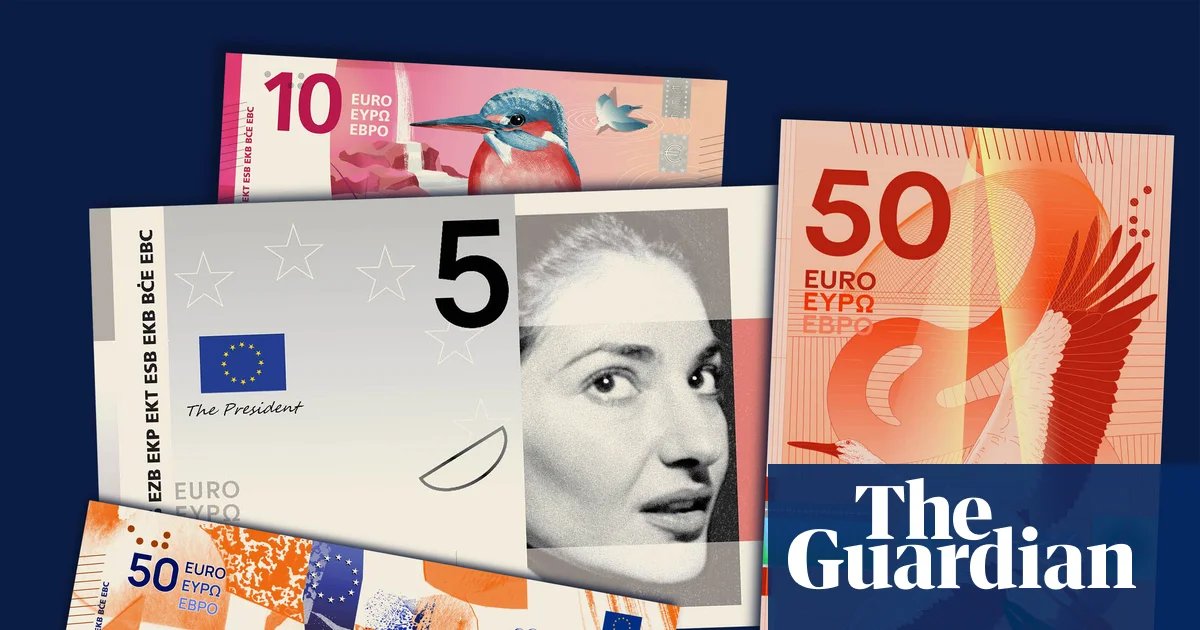
Is Europe best represented by the bold intellect of Marie Curie, the sprawling imagination of Miguel de Cervantes and the intense musical genius of Ludwig van Beethoven? Or by a migrating stork and a bee-eater, swooping across borderless plains and enjoying freedom of movement across European countries?
The quest to settle this issue has engaged a surprising number of people across the continent, after more than 6 million people voted in a survey within just a week of its launch to determine whether the newly redesigned euro bank notes should depict either cultural figures or birds and waterways.
The 10 proposals for a full redesign – the first since the single currency’s paper money entered circulation in 2002 – were unveiled by the chair of the European Central Bank, Christine Lagarde, last week. They include five proposals on the culture theme and five on the wildlife theme.
Each offers a different graphic interpretation on colours and motifs for the €5, €10, €20, €50, €100 and €200 notes that were determined by the ECB in advance.
Europe’s cultural life is represented on the front of the notes by the American-Greek soprano Maria Callas; the German composer Beethoven; the Polish-French scientist Curie; Cervantes, the author of Don Quixote; the Renaissance polymath Leonardo da Vinci; and the Austrian pacifist and women’s liberation leader Bertha von Suttner, with public scenes of artistic and intellectual activity on the reverse.
The birds selected for the wildlife-themed notes are the wallcreeper, the kingfisher, the bee-eater, the white stork, the avocet and the northern gannet, over different landscapes typical of the continent.
Feedback from the survey on the ECB’s website, which closes on 21 September, will feed into but not solely determine which design the central bank chooses as a winner at the end of 2026. A spokesperson said the outcome of a second, quantitative survey and the verdict of a jury of designers would also have a bearing on its choice. A combination of the two themes is not expected.
The new notes, which will continue to be printed on paper rather than polymer as in some countries such as the UK, will not come into circulation until 2030 or 2031.
The 10 shortlisted designs, picked from 1,241 applications to an open call in 2025, are all by creatives who don’t usually design bank notes, and some look radically different from paper money anywhere else around the globe.
A Dutch book designer, Joost Grootens, has cropped the images of cultural figures tightly around their eyes, accentuating their vision rather than their iconic status, while Jan Robert Dünnwelle, a German illustrator, has rendered the same personalities in the free-flowing, sketchy style of a graphic novel.
In the French artist Isabelle Daëron’s proposals, the birds are flying across a vertical layout rather than the more conventional horizontal one, as are those of Ville Tietäväinen, a Finnish graphic designer who has depicted the bird’s journeys in sequence, progressively moving from the mountains to the sea.
Philippe Geoffroy, the head of section for new banknotes at the ECB, said: “The feedback from the public has been very clear. They want money that feels European.”
after newsletter promotion
In Britain, the Bank of England drew some ire earlier this year when it announced that redesigned notes would depict wildlife instead of historical figures such as Winston Churchill or William Shakespeare. To some commentators, the “apolitical” animal motifs epitomised the struggle to identify shared cultural rallying points in politically polarising times.
The new euro notes seem to take a step in the opposite direction. Until now, euro banknotes have deliberately depicted “neutral” motifs in order to avoid offending individual member nations: imaginary bridges, doorways and windows that exemplify historic architectural styles without depicting specific real-life European buildings or places.
New notes including the face of the mythological princess Europa in the watermark and the hologram stripe were introduced in 2013 without changing the overall design.
Yet while the current redesign is similarly motivated by the need for new security features, the EU is also not letting an opportunity for identity-building go to waste.
“The main reason behind the re-design is to stay well ahead of counterfeiting,” Geoffroy said. “But along the way we want to increase identification with the single currency and make it more graphically meaningful. We want to move away from neutrality.”
The lineup of cultural icons is not only finely balanced to represent different corners of the eurozone (albeit with a glaring hole in the Baltics). It also showcases artists and thinkers who cannot be claimed by just one country, either because their work transcended borders or because of their migratory biography.
Callas was born in New York but her career flourished in Greece and Italy. The career of Curie, who discovered radium and polonium with her husband, Pierre, spanned Warsaw and Paris. Von Suttner spent time in Prague, Tbilisi and Vienna.
While none of the birds that would be depicted on the wildlife notes are exclusively found in Europe, they would be paired on their flipside with pictures of buildings that house the EU’s political, legal and financial institutions in Brussels, Strasbourg, Luxembourg and Frankfurt.


![Only 63 Miles: British Airways’ 11 Shortest Boeing 777 Routes Revealed [Map]](https://dailynewsnblog.com/wp-content/uploads/2026/08/108-british-airways-boeing-777-300-nate-hovee-_-shutterstock.jpg)