 dailynewsnblog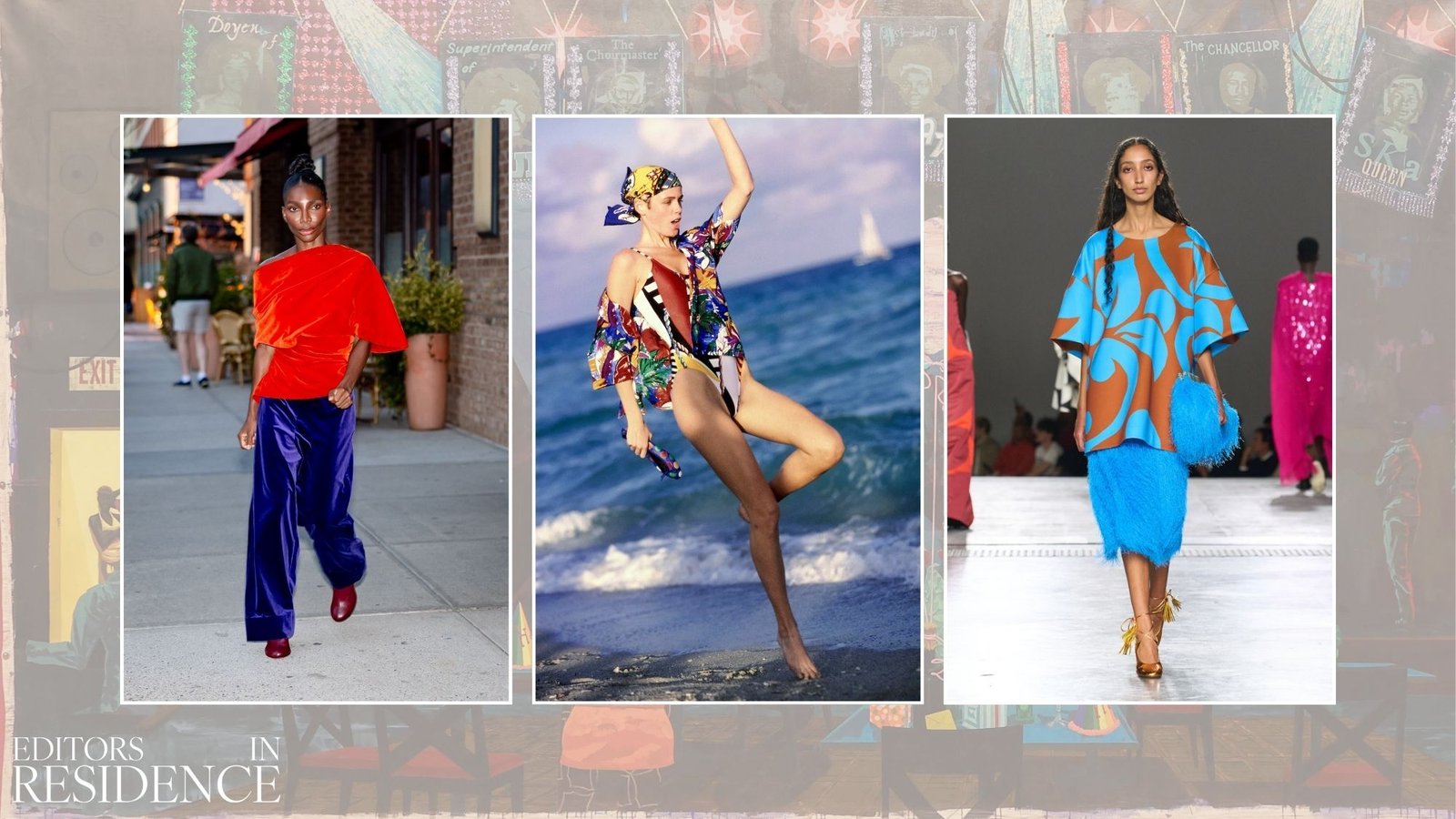
The cyclic return of colour in dark times is one of fashion’s most consistent relationships. Once again, the fashion people of the world are feeling dopamine-depleted and seeking a boost from their wardrobes. Julian Klausner at Dries van Noten proved he has no fear in this area with his spring/summer 2026 offering that boasts high-octane tones dripping with crystals. Matthieu Blazy’s Coco Beach debut breaks up nautical palettes with mythical mermaid brights. Michaela Coel has been spotted in multiple colour-blocked ‘fits, styled by Nell Kolonji, that prove colour doesn’t have to be complex to leave an impression. Colour can be intimidating, but reimagining a simple outfit in bright, unexpected tones is the ultimate low-effort-high-payoff dressing hack.

(Image credit: Getty Images)
As a devoted colour-blocker who doesn’t gatekeep, I can tell you that inspiration is everywhere. Finding the perfect colour pairings is a muscle that needs to be trained, unless you’ve been blessed with “the eye”. With four of these sharp eyes between them, Jasmina and David of “#1 fashion TV show”, Jasmina TV, are a colourfully dressed duo that tour the best stores across the globe so we don’t have to. Jasmina has a penchant for outfits inspired by the unending colour combos seen on Monster Energy cans. “The OG green and black Monster drink is always a classic, but they have so many flavours, and it’s always two colours, like white and purple—I just had that the other day,” she said. (She swears she’s not sponsored.)
David looks to children’s toys when he needs to feel inspired, which is a sentiment I am very familiar with, having a 3-year-old sidekick who enables me to buy Chanel pumps that match his Hot Wheels Monster Trucks. “They always have the most unexpected colours!” exclaims David. There’s a joie de vivre in finding the beauty in unassuming places, and as a bonne vivante in training, I present to you a starter pack for top-tier colour-blocking.


(Image credit: Getty Images)
The 3 Rules for Wearing Colour in 2026
1. The more forbidden the colour pairing, the better (red and green should never be seen? I’ll be the judge of that).
2. You do not need colour analysis. Wear colours that suit your personality and the energy you want to summon.
3. Nothing matches, but everything goes; contrast is everything. If you don’t believe me, ask Patricia Fox.
4 Places to Seek Colour Inspiration
Colour in Fashion

(Image credit: Getty Images)
Escada was founded in 1978 by German duo Margaretha and Wolfgang Ley. Through the ’80s, Margaretha Ley’s design vision soared in popularity, with her penchant for daring colour pairings, embellishments and maximalism. When Ley passed away in 1992, design was led by Michael Stolzenberg and then Todd Oldham in 1994—another master of colour whose mischievous creations were a favourite of fictional fashion icon Fran Fine of The Nanny.
I recently bought this vintage pink-and-green houndstooth Escada suit from Lost In Roses, and inside the package was the campaign image showing the suit in all its glory on model Gail Elliott. Margaretha Ley’s Escada is synonymous with fearless colour. One quick Google search of her campaigns from the ’80s and ’90s produces an endless stream of pairings to try. Yasmeen Ghauri was an Escada girl, and images of her in shocking pink-and-green miniskirt suits can rewire your brain! There are very particular shades of blue and green found in Escada collections that are rocking my world at the moment. Zara Larsson would look amazing in vintage Escada as a progression from the fashions she’s currently sporting for her “Midnight Sun” era!
It doesn’t end at Escada; everyone’s favourite fashion girl, Amanda Murray, often looks to the ’80s as a starting point for her bright outfits. “I feel really connected to the effortless maximalism of ’80s fashion,” she says. She cites films like Desperately Seeking Susan and 9 ½ Weeks as recurrent references.
Colour in Art

(Image credit: Getty Images)
If we can’t trust the great visual artists of the world with crafting a colour palette, then who? Think Yves Saint Laurent’s 1965 Mondrian collection that replicated the simple-but-effective use of primary colours to create something timeless. Monsieur Saint Laurent also lifted the colour palette from Picasso’s 1937 “Portrait of Nusch Eluard” for a jacket in his autumn/winter 1979 collection, which was an homage to Serge Diaghilev, who founded the Ballet Russes. It’s technically a print, but Gianni Versace’s fixation on Andy Warhol’s punchy, technicolour portraits inspired Dario Vitale to birth the shoes in every It-girl’s wardrobe right now from his one-and-done Versace collection.
Challenge yourself to walk around a gallery and base an outfit on your favourite painting. A few months ago, I saw Kerry James Marshall’s exhibit titled Kerry James Marshall: The Histories at the National Gallery. The colours he uses in his work are phenomenal: bright blues, teals, crimson reds, baby pinks, a slew of yellows, all offset by the deep and significant shade of black that defines his works. He doesn’t stray from his preferred palette too much, but by varying the tonality and which colour takes the lead, he can convey a different mood. Drawing inspiration from artists not only guarantees a top-tier colour story, but it also sharpens the mind. A look and a lesson in the arts? That’s a win-win.
Colour in Nature

(Image credit: Getty Images)
A rule of thumb is that if a colour pairing exists in nature, it’s meant to be. From poisonous frogs to spring’s first burst of tulips, Mother Nature’s colourful outbursts know no bounds. Someone who routinely looks to natural forms for inspiration is Jonathan Anderson. At Loewe and now at Dior, we have seen his botanical shoes and foodie fashions turn into best-sellers. In 2022, Anderson showed giant peace lilies as tops and shoes at Loewe, but if you were to strip it down to just colours, it evokes Jacquemus’ La Casa show in Capri for autumn/winter 2024 that shared the strong reds and buttery yellows of the peace lily, whilst also introducing contrast via aqua blue and lime green. If I didn’t know any better, I would think Roger Vivier’s SS/26 Belle Vivier slingbacks were inspired by some of nature’s miracles, with their optimistic, springlike colour-blocking.
You don’t need to fly to the rainforests of Borneo to find inspiration; you could look at the fresh colours in your fruit bowl or on your plate. In fact, let’s call it salad dressing, shall we? (Sorry, I had to.) Let a florist freestyle a bouquet for you to dictate the outfit for your next fun outing.
Colour in Interior Design

Turn your hours-long binge of the Architectural Digest YouTube channel into outfit research. If anyone tells you they don’t want to dress like Paloma Elsesser’s bathroom, they’re lying. There are endless books and magazines, like Phaidon’s Living In Color and the beautifully shot Apartamento magazine, that focus on colour themes in people’s houses. I’m sure you’ve experienced the satisfaction of walking by a building that matches your outfit; you can do that on purpose. Take photos of interesting places: landmarks, your best friend’s kitchen, the restaurant you went to on a really good date—anywhere!
I received a postcard in the post from Boden recently (following a particularly colourful order for my son) that revealed the brand’s office mantra regarding colour: “If it’s unexpected, it’s probably brilliant.” A truer sentiment has never fallen on my doormat.
Shop Colour for Summer 2026:

Peachy Den
Kylie Cross Back Top

Staud
Procida Linen Maxi Skirt in Red

Loewe X Paula’s Ibiza
Toy Crystal Flowers Mules


Dôen
Corina Lace-Trimmed Silk-Satin Midi Dress

Pucci
Iride Silk Twill Scarf
Explore More: