 dailynewsnblog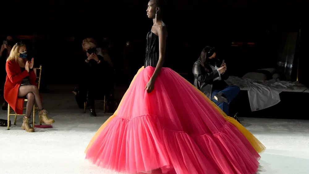
Color is contextual. Red on leather, for example, does not look exactly the same as red on cashmere, even when two garments share the same shade.
This is also true for color combinations. A color might not change in the literal sense, but the perception of it can depending on the color it is paired with. Yellow pops with vibrancy when paired with a contrasting purple, but the same shade of yellow can look soft and inviting if paired with cream.
“So much of what we talked about today comes down to the idea that a color is never just one color. It changes so much depending on what sits next to it,” said Joanne Thomas, director of color at Future Snoops, a trend forecasting agency that advises brands on culturally relevant aesthetics.
Future Snoops hosted a webinar on Thursday to announce its color forecasts for the fall/winter season of 2028-2029. It was held a day before the scheduled launch of FS Color Intelligence, an AI-powered platform than runs on Future Snoops’ deep knowledge in the color palette. While further information about how it works was not shared, Thomas said it is meant to help brands “make sense of color.”
Future Snoops, which was previously called Fashion Snoops, shared in the webinar three out of its five “color shifts,” a seasonal palette that is held together by a theme.

Getty Images for MBFW
Blocked Brights
The first color shift is called Blocked Brights, which Hallie Spradlin, director of visionary at Future Snoops described as colors that give a “hard and unapologetic edge, while keeping it grounded in something similar.” This was inspired by a number of cultural signals, she said, such as Boot Riley’s latest colorful anti-capitalist film called “I Love Boosters.” The Keke Palmer-led movie used “bold and monochromatic colors as this open rebellion against a homogenized and capitalistic system.”
The color anchor in this shift—which Future Snoops dubbed the must-have hue—is cornflower, a shade of blue that “feels bright without feeling too sharp.” It’s a familiar shade of blue that can give the courage to dare with the unknown.
“As one of the most trusted and universally worn hues, it gives the palette permission to take risks elsewhere,” Spradline said, adding that it’s the cornflower that makes a pairing with a shade of red called poppy and a shade of purple called ultraviolet look “confident rather than chaotic.”

WWD via Getty Images
Pink Standard
The second color shift is called Pink Standard, which Spradlin said “carries care and empathy without ever having to say so.” Neither performative or apologetic, this color shift “somehow feels the realest of all.”
It’s a shift that traces back to how pink has lately been redefined as quiet strength, a deliberate act to choose softness in an otherwise fast-paced and callous world. From men wearing pink to push back against the pressures of toxic masculinity to women pushing back against unrealistic body standards, pink has become a color of defiant empathy.
At its core, it’s a “refusal to harden for one or shrink for the other,” said Spradlin. “In an emotionally heavier world, choosing softness is a quiet act of strength.”
“So a color that’s once coded as delicate, decorative, or even gendered, now settles in everywhere, in a room, on a shelf, on a body, or folded into anyone’s everyday palette,” she said. “But its ease hasn’t dulled its pull, and pink still catches the eye faster than almost any other color. It’s quite enough to be a true neutral, but still magnetic enough to lead.”
“This whole shift is pink without nothing left to prove,” she added.
The anchor color for this is the rose hip, a shade of pink which Future Snoops said is unlike any other. “Whereas most pinks either whisper or shout, rose hip does neither,” said Thomas. “It really holds as a color.”

Getty Images for NZFW
Marinated Tones
The third color shift is called Marinated Tones, a shade of green which reflect a slowness that is both a conscious choice and a lived-in experience.
“This is color that’s given time to steep and settle into itself. Nothing here is rushed. Everything is built slowly, the way heritage craft takes years to master, or flavor that deepens the longer that’s left to sit,” Spradlin said.
This is inspired by cultures of craftmanship and archival preservation, she said, highlighting the ways in which physical media has started regaining its relevance “as taste becomes infinitely scrollable and disposable.”
Thus, it makes sense the anchor color for this shift is the pickled fennel, described as “a color that has been waiting.”
“The pickle fennel comes from marinated mid tones, which celebrates hues given time to deepen, steep, and settle. It carries the ease of olive and mustard tones that have anchored palettes for many, many seasons,” Thomas said.